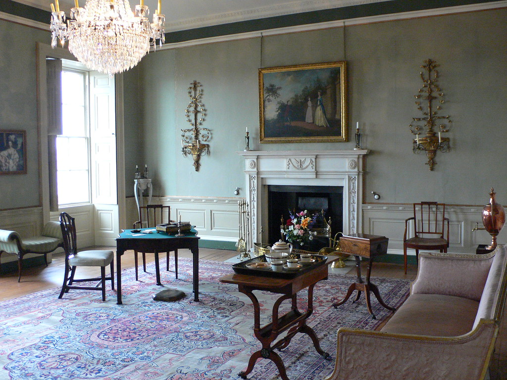
Monochromatic interiors will define 2026, building on a trend that’s been growing for months. The key driver? A desire to reclaim privacy at home. While open-plan living remains popular, people now seek wellbeing through creating more secluded, personal spaces. The
drenching technique
, covering a room in a single colour, is ideal for relaxing spots where you can read, listen to music or unwind. A study or guest room is perfect for embracing this calming, immersive style.
What is colour drenching?
Monochromatic design
uses a single colour, in varying shades
, to decorate a space, highlighting the finishes and textures of furniture and objects. That’s the essence of the trend. At Casa Decor 2025, renowned designers like Marcel Wanders and Francesc Rifé have embraced this technique in their stunning creations.
AI-generated image
idealista/news
Why is colour drenching in fashion?
Colour drenching is gaining popularity as more people seek spaces that
highlight textures and finishes
. To emphasise the texture of a sofa or rug, or the finish of a material, use varying shades of the same colour. This technique is also favoured for being versatile, practical and more economical than others when it comes to transforming and personalising décor.
Where is it best to use the colour drenching technique?
Colour drenching works well in any space, but it’s ideal for smaller areas like bathrooms, dressing rooms, powder rooms, pantries and compact kitchens. Besides adding a modern touch, this technique can help conceal imperfections in materials or details such as mouldings and skirting boards, making your home look
sleek and stylish
.
What colours should you choose for colour drenching at home?
Although it may seem obvious, it’s important to choose a colour you genuinely like – this way, you won’t tire of it. Currently,
brown tones,
such as chocolate and caramel, are very much in vogue. Soft greys are also an excellent choice, offering a classic, timeless elegance. For a child’s room, sage green or a delicate pale pink work beautifully. It’s best to avoid bright shades like red or deep burgundy, as these can quickly become overwhelming.


